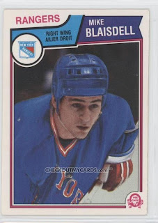
More Airbrush Magic
Here we see a complete paint job on Mike Blaisdell and we learn why in fact the gloves of traded players were rarely painted over in the airbrush process. A very cartoony “glove” is the result as they just can’t deal with all the folds and pieces of the glove. And again, the lettering of “New York” on the jersey appears to have been applied by a four year old. I am not familiar with the style of helmet he is wearing either, I think at one point in time it was a Jofa.
Another full-body attempt on, this time on Chico. The Rockies logo actually looks almost presentable. What’s funny on this one is the “artist” kept the original red stripe from the Islanders jersey at the bottom-left of the image. This small bit of original mesh somehow helps the overall realism of the airbrushing.
Again, the cartoony glove treatment is seen, as well as a failed logo attempt. What I can’t understand about this one is why it was even painted. Christoff had three previous North Star cards issued yet had played the previous season with Calgary. I assume they painted the North Stars over his Calgary uni for some reason even though he was now a King. Confusing.
Bill Flett donning a painted Flyers jersey complete with a melting Flyers logo. Here the gloves were left as the Kings ones they originally were. At least they have nice detail on them, even if they are the wrong colour.
This is an example of OPC’s practice in the early 70’s of not even bothering to try to paint a new jersey and logo for traded players. Just cover up the old logo and put the new team’s logo on the card. Simple. Bruce Gamble seems to be in the middle of saying something to the photographer. Also, he looks more like a bus-driver than a professional athlete.
Here’s a fairly average logo rendering, and with goalies the original gloves can be kept. It looks to me like he’s wearing jeans though which makes him appear more like a fan wearing a replica jersey.
What is it with goalies of the 70’s not looking like athletes, Edwards looks like a deli-owner more than a goalie.

I’m not quite sure what jersey Ernie Hicke was originally wearing in this shot. He had played the two previous years with the California Golden Seals who wore nothing close to this orange jersey. As near as I can figure it may be with the Salt Lake Golden Eagles of the old Western League with whom he played the year prior.

This one is simply atrocious. It looks as if it wasn’t even airbrushed, and more like like it was oil painted. You can see the delicate brush strokes on the over-sized Whalers logo. To top it off, (literally) it looks like Quennville’s helmet is made of felt, brutal.

Another awful Whalers attempt. It must be the terrible green that makes it difficult to paint. Looks like this was painted with a roller.

Two more beauts here. Burrows looks like he’s in the middle of an Impressionist painting, nice attention to detail on the collar tie-up laces on both.


Bobby Orr’s two Black Hawks cards from 1976/77 and ‘77/78 are both airbrushed and then for his final card in ‘78/79 OPC uses a two year old photo. His first Hawks card is an obvious brush-job and his gloves are only half painted as the black from the Bruins could be used for the lower part of the Hawks gloves.
 Orr’s next card is even worse. One would figure they could have gotten a shot of him with Chicago as he played 20 games for them in ‘76/77. Instead, OPC used an old shot of Bobby sitting on the Bruins bench, notice the Bruin player sitting beside him.
For his final card in ‘78/79 we see Orr sitting on the team Canada bench, (what is it with him and photos on the bench?) beside Denis Potvin during the 1976 Canada Cup. A little more respect for one of the greats of all-time would have been nice.


Comments