Worst Hockey Logos...Ever
We here at Nitzy’s Hockey Den, (by ‘we’, I mean ‘me’) enjoy concentrating on the stats and history of the great game of hockey. However for this entry, I am staying away from numbers and delving into the artistic side of the game. Myself being a designer in the animation industry, I am perhaps a somewhat rare breed that has an insatiable need to talk, read, write about and play hockey in addition to having an artistic side. In fact, in my nearly twenty years of work and study in animation, I would say perhaps 2 to 3 percent of artistic colleagues even come close to having my passion for hockey. They would far rather discuss comic books, sci-fi movies or play delightful little dice games. I have another blog, http://www.nitzysnonsense.blogspot.com/ where I have posted mainly my own hockey related art, from t-shirts, homemade hockey cards and designs from my hockey themed children’s books. I digress, in this entry I will post my choices for worst hockey logos ever. I recently discovered this great site http://www.logoserver.com/Hockey.html which seems to have pretty much every logo ever made. I decided to include any logo I could find, regardless of level or league. With the help of http://www.hockeydb.com/ I came up with the following worst hockey logos ever.
Let’s start with what I call the “Art School Drop-Outs”

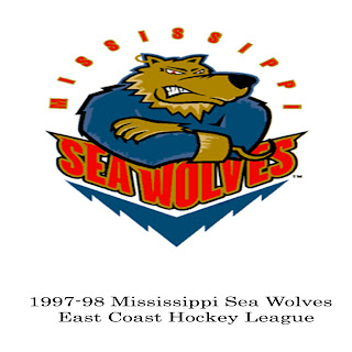
From what I can see, animals are difficult to translate into logo form, specifically the feline sub-genre. Firstly, the Seawolves animal…I guess it’s a seawolf. Not sure if such a creature exists, or even how it would survive. The one attempted to be drawn here does not seem to possess gills or a blowhole, I’d be worried about this creature in any amount of water, especially with that one hooked hand. Overall, this is just a very poor drawing of a very poor concept. Although, compared to the cats that come next, it’s bordering on artistic genius.
 The Wildcat franchise of the old Colonial Hockey League had three full attempts at getting this right. I’d say that the logo actually got worse each year and when the team moved to London in 1994, it seems they got the coach’s kid to design the logo.

The bad feline logos may have started with the Hamilton Tigers of the early 1920’s NHL. Upon moving the Quebec Bulldogs (including Joe Malone) to the steel city, they came up with this gem of a logo, I realize that team merchandise was non-existent in the 1920’s, but come now….this abomination of a one-eyed tiger is simply awful.
 The final big cat entry is somewhat confusing. The team is the Elmira Sugar Kings, yet they feature a terrifying lion snapping a fat hockey stick in half. Not sure what that has to do with sugar, yeah, yeah…King of the Jungle…a lion, I get that, but still a bit of a stretch and awful looking to boot.

Next we have the logos which have two big strikes against them…poorly drawn AND racist. The sly looking Muskegon Mohawk should have a tear running down his cheek in sadness for his poorly drawn visage. It really is hard to screw up a profile of the human face, but this one manages to do it. The Utica Mohawk is not much better. They opted for the more graphically stylized look that just doesn’t work. Incidentally, the worst goalie in NHL history played for this squad on the downside of his career. Michel “Ill-Humour” Belhumeur had a record of 0-24-3 and a GAA of 5.36 with the expansion Washington Capitals in 1974-75. He played 24 games for Utica with a 4.08 average this season.
Let’s start with what I call the “Art School Drop-Outs”

From what I can see, animals are difficult to translate into logo form, specifically the feline sub-genre. Firstly, the Seawolves animal…I guess it’s a seawolf. Not sure if such a creature exists, or even how it would survive. The one attempted to be drawn here does not seem to possess gills or a blowhole, I’d be worried about this creature in any amount of water, especially with that one hooked hand. Overall, this is just a very poor drawing of a very poor concept. Although, compared to the cats that come next, it’s bordering on artistic genius.
 The Wildcat franchise of the old Colonial Hockey League had three full attempts at getting this right. I’d say that the logo actually got worse each year and when the team moved to London in 1994, it seems they got the coach’s kid to design the logo.
The bad feline logos may have started with the Hamilton Tigers of the early 1920’s NHL. Upon moving the Quebec Bulldogs (including Joe Malone) to the steel city, they came up with this gem of a logo, I realize that team merchandise was non-existent in the 1920’s, but come now….this abomination of a one-eyed tiger is simply awful.
 The final big cat entry is somewhat confusing. The team is the Elmira Sugar Kings, yet they feature a terrifying lion snapping a fat hockey stick in half. Not sure what that has to do with sugar, yeah, yeah…King of the Jungle…a lion, I get that, but still a bit of a stretch and awful looking to boot.
Next we have the logos which have two big strikes against them…poorly drawn AND racist. The sly looking Muskegon Mohawk should have a tear running down his cheek in sadness for his poorly drawn visage. It really is hard to screw up a profile of the human face, but this one manages to do it. The Utica Mohawk is not much better. They opted for the more graphically stylized look that just doesn’t work. Incidentally, the worst goalie in NHL history played for this squad on the downside of his career. Michel “Ill-Humour” Belhumeur had a record of 0-24-3 and a GAA of 5.36 with the expansion Washington Capitals in 1974-75. He played 24 games for Utica with a 4.08 average this season.

Finally, we have the Saginaw Lumber Kings. There really is not much to be said about this atrocity. A little bit of knowledge of human anatomy may have been beneficial. The arms and hands bend and join at all sorts of weird places. Yet this logo does make a nice bookend with the Seawolf thing at the beginning.
More terrific logos to come....


Comments